728x90
에러메세지나 알림 등을 보여줄 때 유용하게 쓰일 토스트 메세지에 대한 기록이다.
react-toastify 패키지를 사용하면 쉽게 토스트 메세지를 보여줄 수 있다.
installation
-yarn add react-toastify
-npm install —save react-toastify
- 문서에 다양하게 사용할 수 있도록 기능들이 나와있다.
Usage
- react-toastify를 사용하면 정말 간단하게 토스트 메세지를 구현할 수 있다.
  import React from 'react';
  import { ToastContainer, toast } from 'react-toastify';

  import 'react-toastify/dist/ReactToastify.css';


  function App(){
    const notify = () => toast("Wow so easy !");

    return (
      <div>
        <button onClick={notify}>Notify !</button>
        <ToastContainer />
      </div>
    );
  }

export default App;- react-toastify 문서에 나온 예제다
- ToastContainer 컴포넌트를 root 컴포넌트에서 렌더링한다.
- toast( ) 메서드를 사용해서 토스트 메세지를 띄워준다.
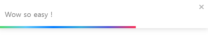
- 위와 같은 토스트 메세지를 볼 수 있다.
- 하지만 내가 원하는 것은 깔끔한 토스트 메세지이다.

- 위와 같이 깔끔한 토스트 메세지를 구현하는데 필요한 핵심 기능을 기록할 것이다.
- 위치를 아래쪽 가운데에 위치시키기
- 닫기 버튼 없애기
- 시간 바 없애기
- 4초 뒤 자동으로 없어지게 하기
- 중복으로 생성되는 일 없게 하기
- 위의 기능들이 핵심적으로 구현하고자 하는 기능이다.
핵심 기능
import React from "react";
import { ToastContainer, toast } from "react-toastify";

import "react-toastify/dist/ReactToastify.css";

function App() {
  const notify = () => toast("Wow so easy !");

  return (
    <div>
      <button onClick={notify}>Notify !</button>
      <ToastContainer
        position="bottom-center"
        limit={1}
        closeButton={false}
        autoClose={4000}
        hideProgressBar
      />
    </div>
  );
}

export default App;- 핵심 기능을 모두 넣은 코드이다.
Position
- position prop을 bottom-center로 지정하면 내가 원하는 아래쪽 가운데에 메세지를 띄울 수 있다.
Limit
- limit prop로 최대로 띄울 수 있는 메세지 수를 지정할 수 있다.
CloseButton
- closeButton prop로 닫기 버튼을 비활성화할 수 있다.
AutoClose
- AutoClose prop로 토스트 메세지 유지 시간을 지정할 수 있다.
HideProgressBar
- HideProgressBar prop로 유지 시간 바를 비활성화할 수 있다.
마무리
- 위의 사진처럼 토스트 메세지를 스타일링하려면 문서를 참고하자.
- styled-components에서의 사용법도 나와있다.
728x90
'Frontend > React' 카테고리의 다른 글
| [React] CRA 프로젝트 초기 설정(ESLint,Prettier) (0) | 2022.11.16 |
|---|---|
| [React] Server State&Client State,React-Query (0) | 2022.09.30 |
| [React] react-hook-form 사용법(useForm, watch) (0) | 2022.08.07 |
| [React] useState batching, 비동기, 동기처리 (0) | 2022.08.06 |
| [React]Router v6 사용법, 관련 Hooks 정리 (0) | 2022.07.23 |


